
There are so many things to keep in mind when designing a logo. This is because your logo is so much more than just a picture. It represents not just your business, but everything behind it. Your mission, your reputation, your core values, and of course your product or service. That’s a heavy lift for a little graphic!
It’s so important to be aware of what makes a great logo, especially if you’ll be designing it yourself. Even if you opt to outsource your logo design, you’ll still need to have a grasp on how to make a good logo as you’ll be reviewing the design and sharing your input until your designer gets it just right.
Creating a Great Logo Starts Before the Design Process Begins
Before digging in to how to design an effective logo, you’ve got a little bit of homework to do. Trust us. This short planning phase will pay dividends during the actual creation process.
Know the Brand
A logo is a reflection of your brand. So, before you can create an effective logo, you must have a clear understanding of that brand. If you aren’t quite there yet, don’t worry. Quickly review the importance of branding and take some time to flesh out the most important pieces.
Research the Competition
This is non-negotiable or several reasons. First and foremost, you don’t want to inadvertently design a logo that looks similar to those of your competition. Not only could it open you up to legal action, but you’d have invested a significant amount of time and money only to have to start over.
Additionally, take a look at general trends in your industry and make the decision to either follow suit or go against the grain. There’s no right or wrong, but great logo design should always be a decision that is made consciously instead of by chance.
7 Things to Keep in Mind When Designing a Logo
What makes an effective logo design? While there are no hard and fast logo design rules, there are still a few tips for creating a logo that successfully meets the criteria we mentioned above. Read on for seven logo design tips and a few extra things to consider when making a logo.
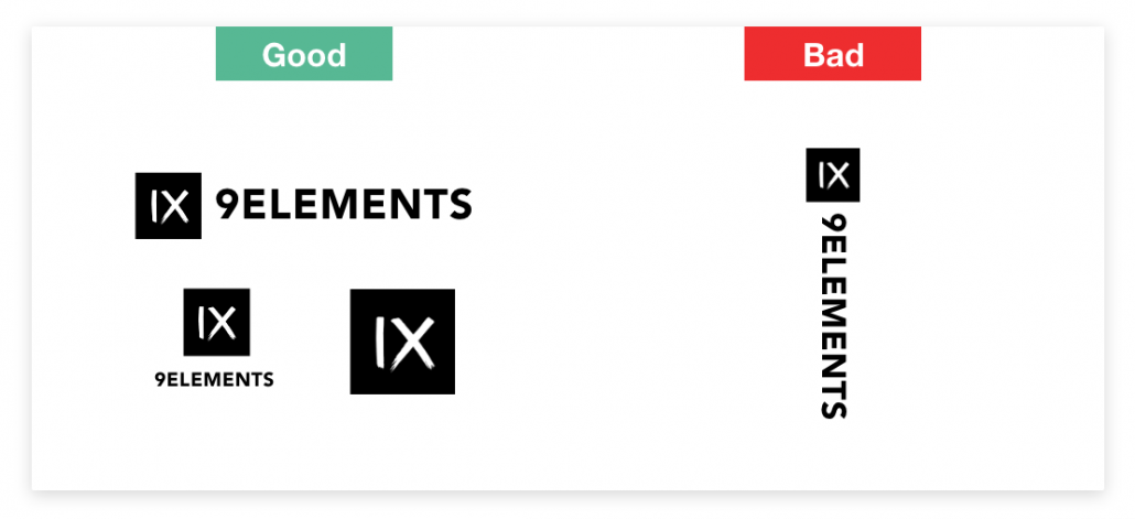
Scalability is a Must
Logos must be recognizable on a small scale. Consider favicons, those little icons that show up on your browser tabs. Your logo needs to be recognizable when it’s that small. If you simply can’t pare down to a single icon, consider creating a second version for use in very small spaces like a favicon, app icon, or social media profile graphic.
Simplicity Above All
There are no definitives when it comes to what makes a good logo design. Generally speaking, though, more intricate designs are less impactful. Unless the rest of your logo design is incredibly simple, skip “extras” like extra lines, gradients, shadows, or even serif fonts. In short, pull everything from a logo that doesn’t represent your brand in its simplest form.

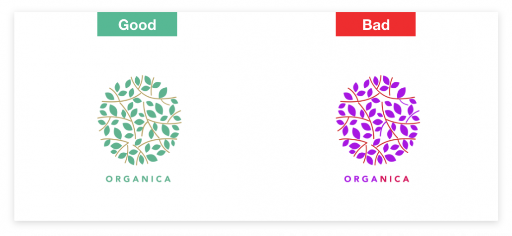
Colors Can Be Powerful
Among the things to keep in mind when designing a logo is how powerful color can be. Red elicits feelings of love, passion, danger, or power. Blue brings to mind a sense of trust, security, or strength. Green tends to elicit thoughts of nature, luck, or money. Color can be used as a tool to convey meaning, which is ideal for purposes of logo creation. Just make sure you choose colors that convey what you’re aiming for.
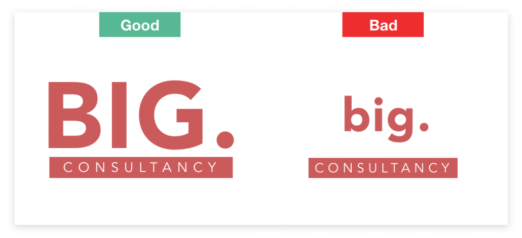
Typography Conveys Meaning
The best simple logos make great use of typography. Similar to color, typography can convey meaning. Refer to your brand image. How do you want to be perceived, and how can you create a perfect logo in that image? For instance, if you’d like to be perceived as authoritative, consider a simple, basic font in all caps. If you’re trying to evoke a sense of nostalgia or playfulness, perhaps something a little different.
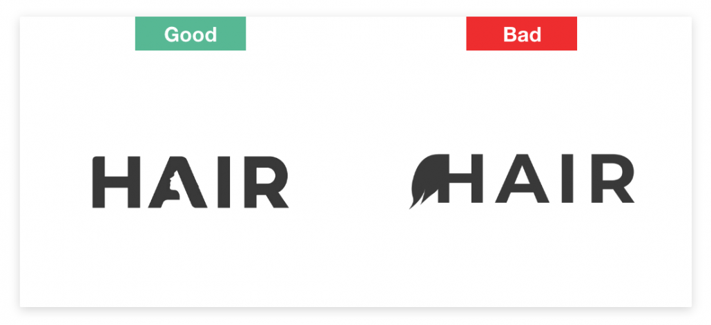
Negative Space Counts
Among our logo design tips, this one might be our favorite. At the bare minimum, be aware of the negative space within your logo. But if you’re trying to figure out how to make the perfect logo, you could also deliberately use negative space to create dual imagery. Have you ever noticed the arrow between the end E and X in the FedEx logo? That’s a brilliant use of Negative Space. Simply making a few small changes to the primary image can turn negative space into something worth looking at.
Contrast is Key
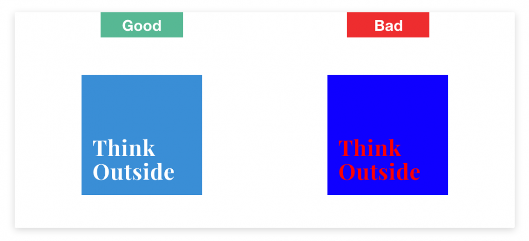
If you opt to use a colored background, ensure it contrasts with the primary graphics well enough for the logo itself to be recognizable. You can have the most beautiful logo in the world, but if it’s difficult to identify, it won’t do you any good.
Alignment Matters
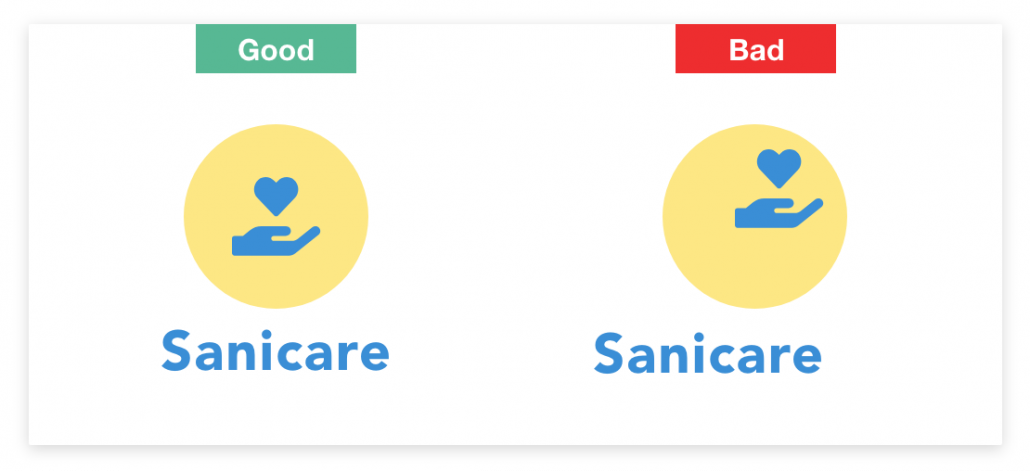
Alignment creates a cohesive look. So, while there here’s no hard and fast logo design rule, here, we suggest you aim to maintain alignment within your logo. It doesn’t necessarily matter if your elements are aligned left right or center, as long as they are consistent.
Bonus Tip: Don’t Stop When You Think You’re Done
Part of what makes an effective logo design is patience. Once you have what you think is THE logo, take a break. Then come back and keep playing. Swap colors, lines, fonts, and sizes. Maybe what you thought was your final version actually is. But you may also come across an iteration you hadn’t even considered before. You never know. That could be THE ONE.

Make a Great Impression with Great Logo Design
There are so many things to keep in mind when designing a logo. One little graphic has less than a second to convey everything about your brand to anyone who takes a peek. Like we said – heavy lifting! But Hungry Media is equal to the task. Our graphic design partners have years of experience creating effective logos that speak to a brand’s unique identity, and we can help you make the most of that logo! Contact us to chat about including a fresh logo design into your website or mobile app.
contributed by Melissa Lucas, senior staff writer


