You only have a few moments to capture users’ attention and prove to them that your app is worth their time (and possibly their money). This is where effective mobile UX design comes into play.
Did you know that 75% of downloaded apps are only opened once? Think about it. Or better yet, glance at your phone. How many apps have you abandoned within the first few minutes of trying them out? How many have sat unused on your home screen for months, or years? What might these apps have in common? Bad UX design. Apps are innately different than desktop-focused websites, which means that developing an app must be done with a different set of principles in mind.
What is Mobile UX Design?
User Experience (UX) design is the discipline that concerns itself with creating a positive experience for the end user of a system. When we discuss mobile UX design, the system we are referring to is a mobile device, most often a smartphone.
Why is Mobile UX Design Important?
The best mobile UX design ensures that your app is not only useful, but usable. That it’s not only desirable, but enjoyable. When users download an app, they’re looking for more than just a mobile-friendly version of your website. So, great mobile app design provides a more robust, personalized experience than users receive when browsing your site on a desktop computer.
Considerations of UX Design for Mobile Developers
User First
Of course, the user always comes first. So, it stands to reason that you have to figure out what the heck the user wants before you can truly grasp how to design for him or her; this is especially true when approaching UX design of apps intended for use on mobile devices. You must accurately assess and address the needs of your mobile users in order to retain them.
Priorities
It’s so easy to get carried away in the beginning of the design process. You have so many great ideas and so many features you want to deliver. However, too many features can actually be unappealing, confusing, and frustrating to new users. The most successful apps on the market start small and expand from there. First, prioritize the features that impact your core objectives.
As your business and user base grow, you can grow your app by adding those “nice-to-have” features along the way.
Intuitive Navigation
Navigation on mobile apps needs to be even more intuitive than that of a desktop site. Most likely, users will be glancing at your app while multitasking, so they to easily identify how it works. Use recognizable icons, gestures, and designs to make using your app as intuitive as possible.
Consistency
Users should also be able to easily identify your brand whether they are using your desktop website, mobile site, or app. This means that you must remain consistent with your design elements for each potential point of access.
Hand Reach Comfort Zones
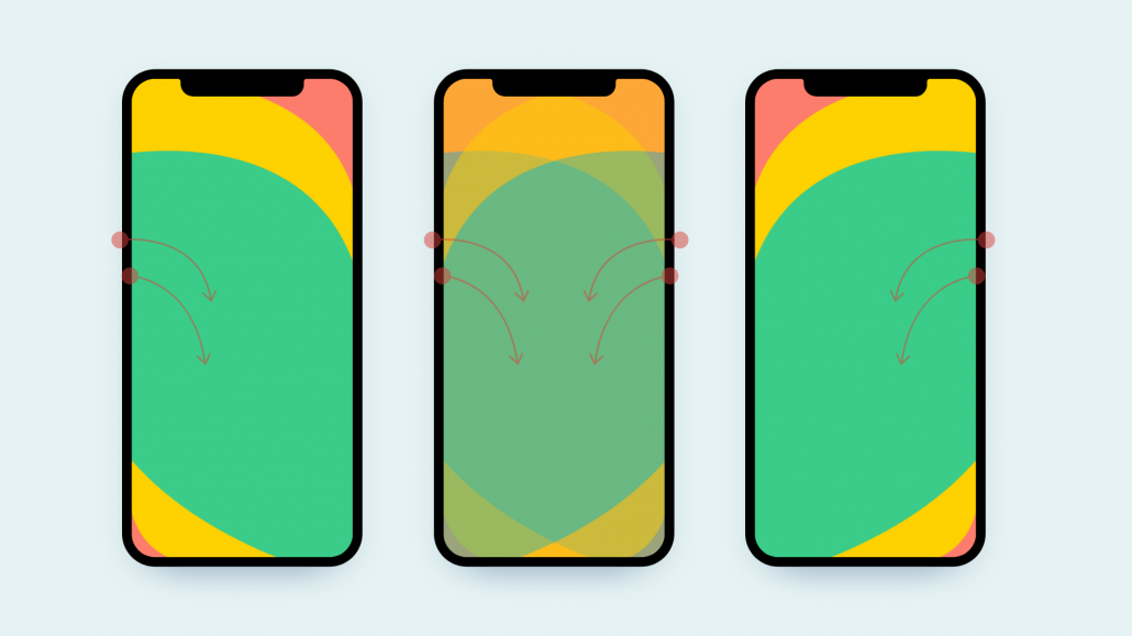
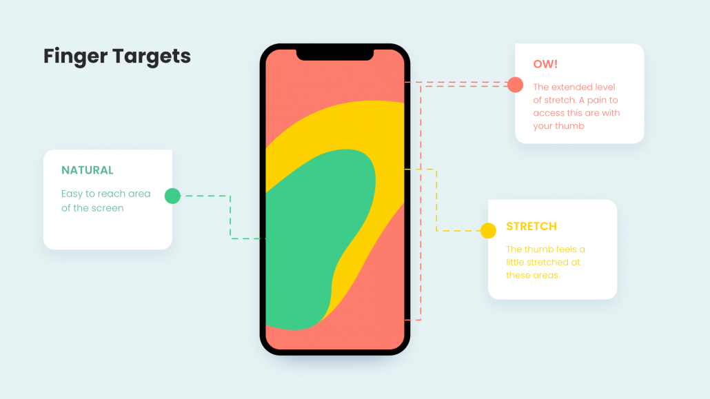
Consider the way in which users will access your app, or more specifically how they’ll hold their phone while doing so. The natural reach for typical users comprises about half of the screen. Individual hand reach comfort zones are based on whether the user is right- or left-handed and whether they hold their phone with one or both hands. Great mobile UX design ensures that the majority of features, especially those which are most frequently used, are within comfortable reach for all users.
Finger Targets
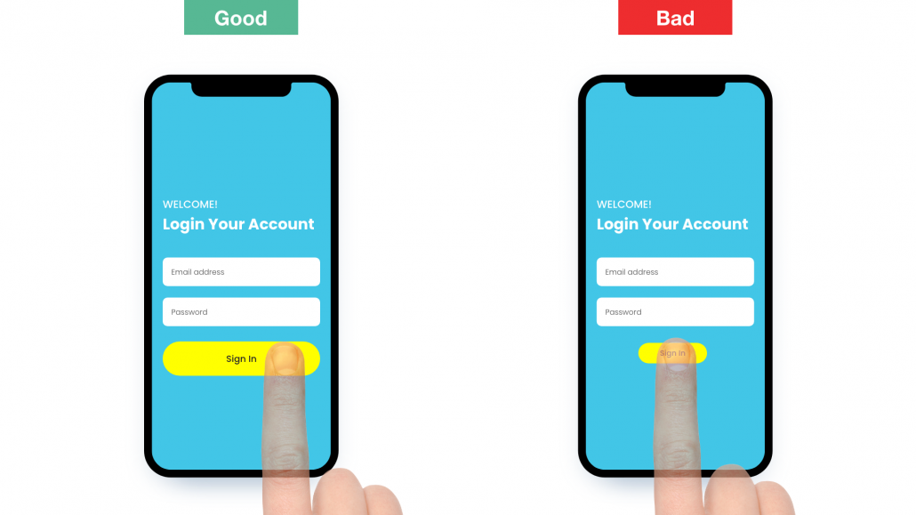
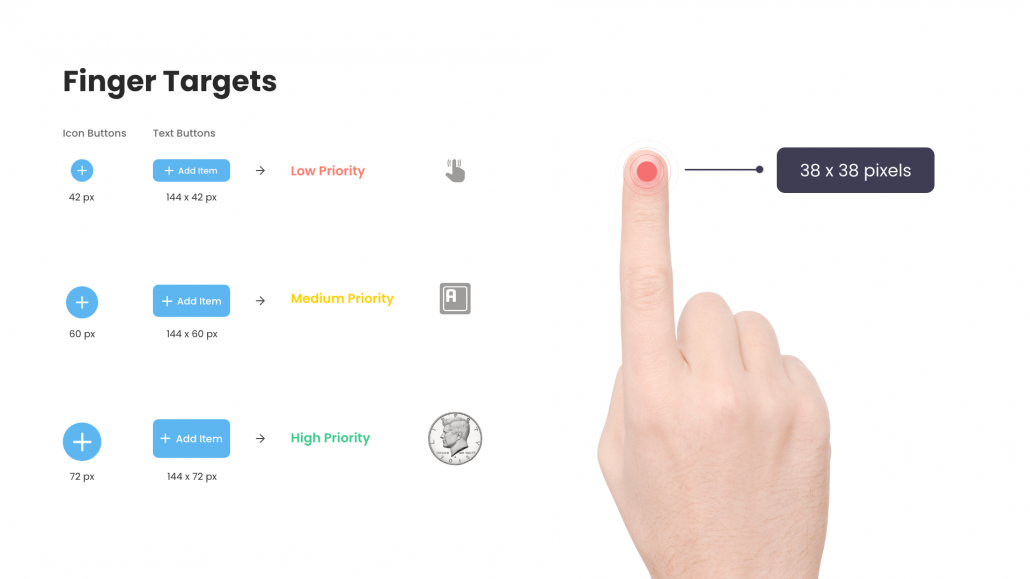
Remember, when it comes time to interact with the app there won’t be a mouse cursor to point and click. Users will be targeting selections with their fingers. Ensure each tap target is large enough for easy selection. Considering the size of the average human fingertip, controls that measure at least 7-10mm are ideal.
Visual Clutter
For the most part, less is more in terms of the display itself. The devices on which your app will be accessed are usually pretty darn small, so space is at a premium. You don’t have to display every piece of information at all times. Establish organized, easy to follow options that provide your users with a clear understanding of how to access the content they are seeking.
Gestures
We’ve said it before, and we’ll say it again. It’s great to think outside the box, but not when it comes to UX and UI design. Mobile app UX design includes ensuring that your customers are able to comfortably engage with your app. Like it or not, consumers are comfortable using their mobile devices in certain ways. Swipe, tap, pinch, repeat. Take advantage of the gestures commonly used on mobile devices and it will be that much easier to engage with your app.
Feedback
Users need to know that the input they are providing is being received. They need to know that they actually pushed that button or completed that swipe, even if it takes a few moments for the results to become apparent. Tactile and visual feedback are the simplest ways to provide this information. Loading indicators, “depressing” of virtual buttons, or dimming of the screen can all be great ways to indicate that input was, in fact, received.
Data Input
And speaking of input, don’t require your users to provide a ton of it all at once. The more data a user is required to input, the more likely they are to abandon the task. One way to address this is to allow your users to access other accounts (such as Facebook or Google) as a means of sign-up, rather than requiring them to input all of their demographic information in order to access your app. The simplicity of this “one-click” method can make or break your app’s success.
User Experience Design for Mobile Applications vs. Websites
User experience in mobile apps is vastly different than in desktop web browsers. Many from-scratch design principles and UX design principles are similar, but companies cannot rely on a desktop strategy to provide a great experience to mobile users. Here’s why.
- Desktop orientation is horizontal, while mobile orientation tends to be vertical.
- Desktop screens are significantly larger than mobile screens.
- Desktop devices use a keyboard and mouse for input, while data is input on a mobile device via fingertip.
- Desktops tend to be used for important, longer-term tasks such as office work or shopping. Mobile phones are used for much faster, often casual interactions.
- Desktop users can open multiple windows side-by-side, while mobile users cannot.
Mobile UX Design Made Easy – With Hungry Media
It’s not nearly as easy to succeed in the digital space today as it was twenty, ten, even five years ago. And the ever-evolving world of technology can make it difficult to break into the mobile market. If you’re unsure where to start, we can help!
Hungry Media has years of experience in the digital creation space, and we specialize in developing apps and websites that help build businesses and revenue streams. Our mobile UX designers know exactly where to start to get your idea off the ground. Contact us today to see how we can help make your vision a reality!
contributed by Melissa Lucas, senior staff writer


