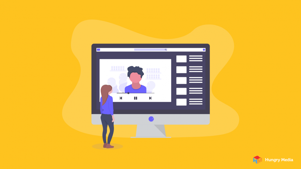
As technology is advancing, so is our ability to support decent multimedia content online. It used to be that the role of multimedia in a website was minimal. This is because the use of multimedia slowed websites down and caused more problems than it helped solve. But as time goes on, technology makes it much easier to support a variety of multimedia. Today, animation, video, imagery, and audio all support and supplement traditional text.
Why is Multimedia Important?
Why use multimedia? First and foremost, every website needs multimedia. It helps you meet the expectations of today’s users, But, in general, multimedia design and development is a powerful addition to any website plan. It increases engagement and the chance of users sharing your content, it grabs attention, boosts the amount of time spent on your site, and can have a major impact on your SEO.
Elements of Multimedia Web Design and Development
So how do you design effective website multimedia features? Take a look below.
Videos
Using video is the ultimate in multimedia website development and a great way to share the personality of a speaker or express the identity of a brand. Furthermore, given the same amount of time, videos can cover more content than text. Although bandwidth constraints are becoming less of an issue, videos on websites today should still be relatively short and cover small(ish) viewing areas.
- Explainer videos give the details about your product and why it’s so great.
- Tutorial videos show how your product works and provides tips on the best ways to use it.
- Testimonial videos allow users to connect with the subject of the testimonial in a way that plain text or even text combined with photos cannot.
- Reviews are similar to testimonials but with a focus on objectively discussing the pros and cons of the products or services in question.
Images
It stands to reason that if a picture is worth 1,000 words, then images can provide significant clarity to text. But that means, on the flip side, that images have the ability to confuse users, too. So before throwing images up willy-nilly, pay special attention to the ways in which they add or detract from your message. There are several types of images and graphics that can be used:
- Photos are the most commonly used type of graphic. While they can (and should, at times) be used solely for the purpose of adding some flair to a website, they also serve many additional purposes. They can provide context, help clarify the text, and most importantly can foster a connection with the audience.
- 2D Graphics are helpful when attempting to grab and hold users’ attention as well as convey meaning. Furthermore, graphics can provide a visual representation of a potentially complex concept within seconds, making it easier for users to scroll through your site without missing important conversion points.
- Infographics are a type of graphic that deserve their own category because they serve a singular purpose. They are a visual representation that creates an easy-to-understand overview of a specific bit of information. They tend to be a combination of text and graphics.
Audio
Sound provides a channel that is separate from the visual display.
- Voiceovers create complimentary clarity without creating confusion on the screen.
- Subtle background audio can be beneficial but should be used sparingly and should never draw attention away from the content on which you want users to focus.
- Non- speech sound effects add an extra dimension of engagement as well as provide feedback to the user – think of the sound you hear when you click a button or make a selection. It’s subtle, but it lets you know that your input has been received.
Animations
Moving images are very good at attracting our attention. Animation, used in the right way, can increase conversions by drawing users’ attention to the most important information on your website. However, poorly placed animations distract from that important message. Thus, animations should be used very thoughtfully. Examples of animations include changes to icons or text items when a mouse hovers over them, a loading indicator, or a photo carousel.
Hungry Media Helps Make the Most of Your Multimedia Content
Whether you need some additional guidance about the importance of multimedia in websites, want to integrate animations into your homepage, add video to your testimonial page, or completely rework your webpage and multimedia design, Hungry Media has your back. Our four-step approach helps uncover the needs and scope of your project, and our team of expert designers and developers can take it from there. For more information on how to make the most of your website’s multimedia content, contact us anytime. We can’t wait to meet you!
contributed by Melissa Lucas, senior staff writer


