Do you hear people use web design terms and feel like they are speaking a completely different language? If so, you’re not alone. Honestly, the digital world has come upon us so quickly that many of us simply need some time to catch up. That’s where our Website Terminology Series comes in!
Here, we’ll put some of the most common web design buzzwords into easily understandable terms. That way, when it’s time to talk tech, you won’t be left behind. Be sure to check out the first part of this series – Website Terminology 101: The Basics – which explains the meaning of some tech terms that aren’t necessarily web related, but are helpful to understand as you learn more about other web design vocabulary words.
Web Design Jargon Explained
Use the following website design words list to help you decipher what, exactly, is meant by some of the most common web design terms and lingo.
What is a Sitemap?
A website map, or sitemap, provides information about the pages, media, and other files contained within a website as well as the relationships between them. Search engines use sitemaps to determine where to look for important information, which then helps them decide whether that information is what users are searching.
While sitemaps aren’t 100% necessary, they definitely improve a search engine’s ability to quickly crawl and index websites, especially those which are particularly large or complex.
What is Navigation?

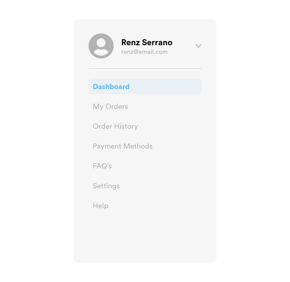
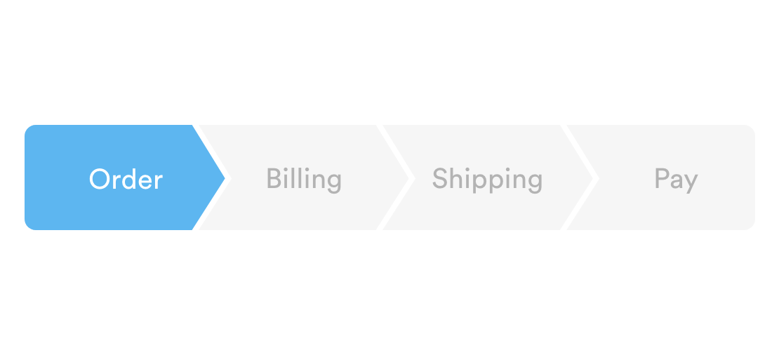
In web design, effective navigation is a must. Basically, navigation is a collection of user interface components that help visitors move through a website in search of specific content and features. Most commonly, web navigation is found in the form of menus, text, links, and buttons.
What Does UX Stand For?
UX stands for user experience. But what is UX in terms of web design? UX design refers to a method of designing in which user experience is a top priority. This includes ensuring websites are functional, easy to navigate, load quickly, are pleasing to the eye, etc. Ultimately, UX describes a users’ perception of your site and their response after interacting with it.
What is Information Architecture?
Information architecture is focused on creating schemes and structures to organize website content in a way that helps users find information and complete tasks with ease. Effective information architecture includes labeling systems, navigation systems, and search systems, all of which are dependent on having a clear understanding of how visitors will naturally want to use your website.
What Is a Website Wireframe?
A wireframe is a basic framework for website design. Wireframe designs are much like the blueprint of a building, which allow builders to easily visualize the location of important features such as plumbing or electrical elements and are devoid of any interior design elements. In this sense, a wireframe serves as a visual guide for building a website. This black and white outline tells the developer which elements to include, where they are located, and what functionality they must encompass.
What Are Website Breadcrumbs?

Hansel and Gretel created a trail of breadcrumbs to help find their way back home, right? Website breadcrumbs are intended to help users accomplish the same goal – effectively backtrack without losing their way. Breadcrumbs in web design serve as a visual aid that indicates a user’s location within a site’s hierarchy and provide the option of moving back just a few steps, rather than starting over completely requiring use of the browsers back button. They are most often used when a site contains a large amount of information within a single, structured hierarchy. You often see this within large retail shopping sites where products are grouped into smaller and smaller categories.
What Is a Webpage Header?

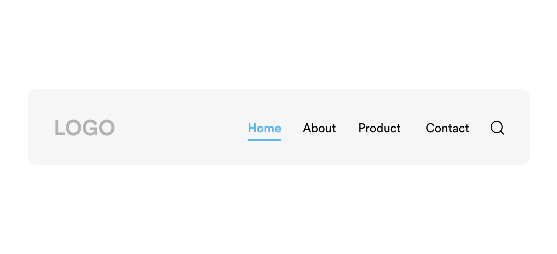
Website headers sit atop each page of a website and serve several purposes. First and foremost, they provide a sense of visual cohesion across all web pages included in a single site. But headers also include several key elements – logos, navigation menus, and page titles for starters. Finally, headers are the place users will look for ancillary features such as a search bar, shopping cart, login link, and notifications.
What Is a Hamburger Menu?

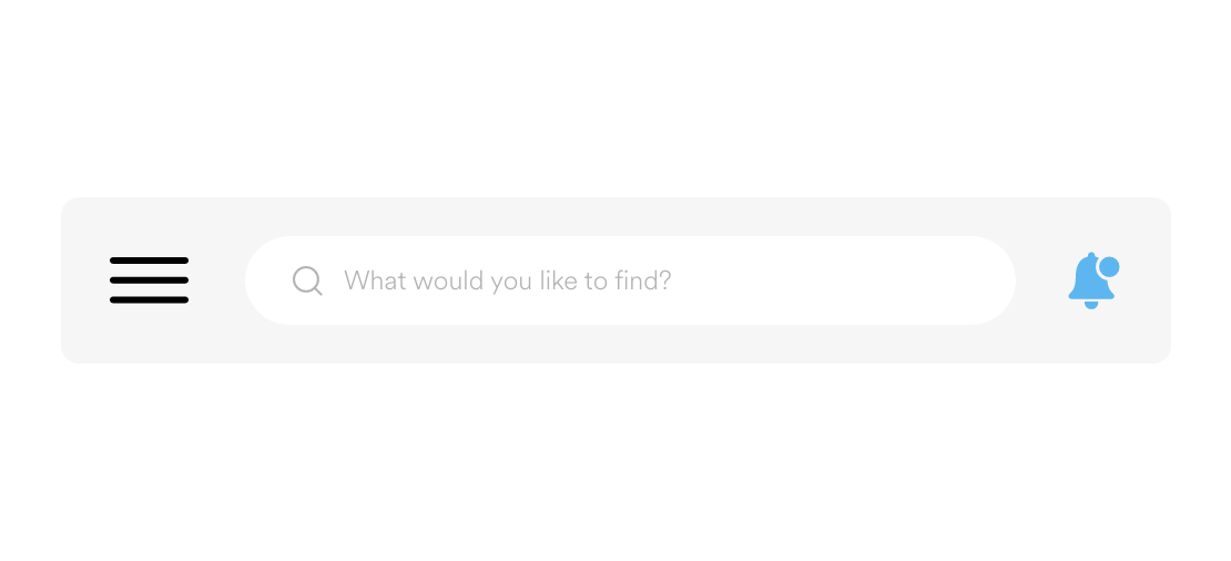
A hamburger menu is the name given to the menu icon, usually found in the top corner of a webpage, that expands to reveal additional menu items. It is named so because the three horizontal lines resemble a hamburger patty between two buns. Originally developed for use on mobile sites, hamburger menus have been widely adopted for use on all screen sizes because they allow websites to offer the menu and navigation options users expect without cluttering the screen.
What Does GUI Stand For?
GUI stands for graphical user interface and describes a visual way of interacting with a computer. It’s hard to remember a time when we typed commands which told our computers what to do, but this was the reality just a few decades ago. Graphical user interfaces simplified this task, making computers much easier for the everyday person to use. Instead of typing commands we click on icons, windows, or menus. These visual elements make up the graphical user interface.
What Is a Style Guide?
In web design, a style guide is a set of standards that includes instructions such as how and where a logo is used, how to choose the right font for any given text, what colors to include in each page, etc. The purpose of a style guide is to ensure uniformity across all web pages and platforms.
What Does WYSIWYG Stand For?
What you see is what you get! WYSIWYG is one of the longest web design acronyms out there. A WYSIWYG HTML editor allows website content to be manipulated in a form that resembles its final appearance. For instance – instead of writing a bunch of code to determine the placement and aesthetic of a button on your website, a WYSIWYG editor allows you to actually choose the button you want and move it around your webpage until you find the perfect location. The end result is the same, but these types of editors (such as Squarespace) are much easier for non-developers to use.
What Is Anchor Text?
Anchor text is the visible, clickable text of a link. While the link might be: www.hungrymedia.co/blog, anchor text can be utilized to make it part of a sentence. Perhaps we’d say: Check out our web development blog for the latest industry tips and tricks.
Both hyperlinks will take you to the same page, but when you link anchor text, that text effectively describes the page to which you are sending users. When the anchor text and the link itself correlate, it is easier for search engines to determine that the linked page would be relevant to a searcher’s query. In the end, effective use of anchor text can improve SEO rankings.
What Is a Slider?
There’s no doubt that graphics and images are important to a website, but too much of a good thing can be detrimental to web design. A slider allows for the display of multiple images in a way that doesn’t create visual clutter on a webpage. When a slider is in use, you may see three or four images at a time but have the ability to easily scroll through many more. Some sliders may move on their own, while others require input from the user to scroll from one image to the next.
What Is Mobile First Design?
Two of the most frequently used words in design these days are mobile and first. A mobile first strategy bases the functionality and aesthetic of a website on the needs of mobile users. From there, developers create versions of the same site for laptop or desktop users.
This is different from traditional web design which assumed users were primarily viewing websites on desktop monitors. Sites would be designed for these users and then “condensed” for viewing on a mobile screen. In today’s market, starting small and adjusting larger is much more efficient (and cost effective) than trying to cram everything visible on a desktop computer into a single smartphone screen.
Work with Hungry Media
When the time comes to build a website or app, it’s helpful to have an understanding of basic web design terms. But don’t let all of this web design lingo send your head spinning. Hungry Media’s team of project managers and designers works with a wide range of clients – from small companies whose CEOs are still using flip phones and aren’t familiar with any web page design terminology to large corporations whose IT departments can talk tech all day long. Contact us today to learn how we can help you build the website of your dreams. We can’t wait to meet you!
contributed by Melissa Lucas, senior staff writer

