Designing your website involves so many considerations and requires more than a few decisions on your part. While the look of your text might seem inconsequential compared to the content of it, keep in mind that minor tweaks to font choices for websites can have a major impact on their overall impression and usability. Just like various colors or layouts can evoke emotion or direct users’ attention, so can the fonts used in web design. Continue reading to learn how to choose a font for your website and what to consider along the way.
Importance of Typography
It has been said that typography exists to honor content. In this sense, choosing the right fonts for website content can be an incredibly powerful design tool. In fact, the right typographic choice will reflect all needs of your project, including those that are technical and functional, as well as aesthetic, in nature.
The number of available fonts to use on the web is seemingly infinite, which is why uncovering the best fonts to use for websites can be a daunting task. But this also means that you can customize your website in almost any way you like, at least as far as your text is concerned.
Font Types
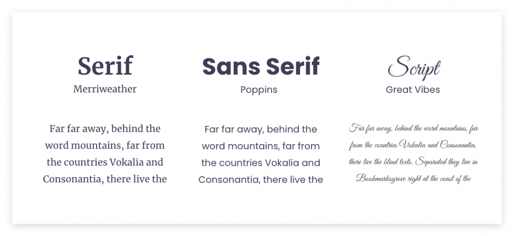
There are three main categories of fonts, called typefaces.
Serif
Serif fonts have been around the longest, and they include a stroke at the beginning and end of the main horizontal and vertical lines. These extra strokes are said to help the eyes move more easily from one character to the next – as if they are guiding the reader.
Sans Serif
Sans Serif fonts weren’t widely used until the 19th century, and they do not include the extra strokes mentioned above. They are probably the most common fonts on the web, and it is said they came about as the need evolved for clearer headings that could be easily read from a distance.
Script
Script fonts tend to mimic handwriting. Formal script fonts are reminiscent of classical handwriting while casual script fonts include fewer flourishes and tend to reflect a more modern aesthetic.
Fonts Project Feelings
The best web design fonts to use depends on the feelings you want to convey. Serif fonts tend to project an air of tradition, respect, reliability, and comfort. Sans Serif fonts are generally viewed as modern and give the impression of cleanliness, objectivity, and stability. Script fonts are often used when trying to convey elegance, affection, or creativity.
Functionality vs. Design Features
The stylistic range of a font can be broken down into two components, and the best fonts for websites are chosen in response to the need for each.
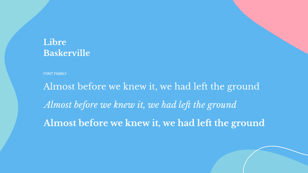
Functionality refers to the available variety of visual options within a single font family. This might include options for italics as well as different weights from thin and light to bold and dark. Functionality can also include the spacing of characters ranging from tightly condensed to widely spaced.
How to Choose a Font for a Website
Determine Scope
Continuity is important when choosing a font family, as major differences in fonts can be distracting at best and confusing at worst. So, before you randomly start selecting cool fonts for your web design, it’s a good idea to take a step back and look at the scope of your project. How many pages, headings, subsections, menus, or other text items does your website require?
The greater the scope of the project, the greater the need will be for a large font family with a variety of styles, weights, and variants from which to choose. Good fonts to use for websites allow you to differentiate various aspects of your website or app without confusing the user.
Reflect on Your Brand
We talk about branding a lot when we discuss website needs, and learning how to choose a font is no exception. How do you want your users to feel when they look at your website? What “vibe” do you want to give off? What do you stand for? Once you determine a few of these answers, you’ll have narrowed down your font options significantly, making it much easier to see your remaining options for what they are, compare fonts, and make a decision.
Create a Hierarchy
When deciding on professional looking fonts for website design, it can be helpful to choose different variations from the same font family for different areas of your site. One font could be an all-caps version, one could be italicized, one could be bold, one thin. And don’t forget that you can play with colors, too! The options are endless, but if you stick with the same general font style you’ll be less likely to create visual conflict within your site, which is one of the most common design mistakes we see.
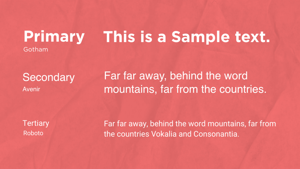
- Primary Fonts are used for larger text such as headings and logos. Something that’s a little less conventional and higher contrast works as a primary font.
- Secondary fonts are mainly used for body copy and will be seen most frequently throughout your site.
- Tertiary fonts are used as “accent” fonts and can be seen in places like menus, sidebars, and calls to action.
Assess Readability
Readability is always a consideration and should be a top priority for secondary fonts. Generally speaking, serif fonts are more readable when in hard copy, and sans serif fonts are easier to read in the digital space. Script fonts can run the gamut, depending on their intricacy.
Confirm Scalability
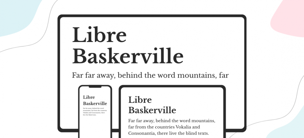
A mobile-first strategy is a must these days. Which is why another factor to consider when determining good website fonts to use is what the text will look like on different screen sizes. Will your copy look just as intended when it’s viewed on a mobile device? What about on a wide desktop monitor? How about on a large television screen? The variety of screen sizes available is what makes this so important when deciding which font is best for your website.
Determine the Correct Font Size
The length of your text is a factor to consider when determining the best-looking font size. And the font size you use may determine what style of typeface you go with. Serif fonts are often difficult to read on screens when displayed less than 16(ish) point.
Think About Other Languages
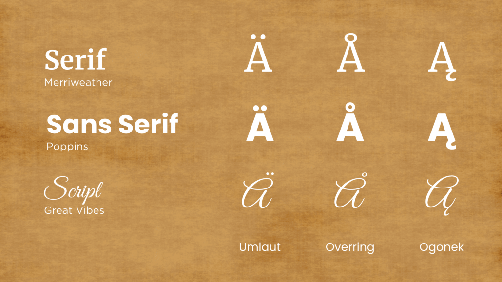
Also of importance when choosing a font for your website is selecting options that include characters for other languages. This way, if your website is translated, your design will remain consistent. Many font families include multiscript support.
Font Pairing
Once you are comfortable using font variations on your website, you can begin to consider combining different fonts for even more impact. There’s no right or wrong way to do this, and the number of possible combinations is endless. However, if you keep the above web design font tips in mind, you’ll be much more likely to maintain a user friendly design.
How to Preview Fonts for Your Website
Flipping Typical is a great resource for previewing available fonts all in one place. Simply add your text to the preview bar and view it in hundreds of different fonts, side by side. This is a fantastic option to help you narrow down the best fonts for your website design before making a final decision.
Find the Best Type for Your Site
Website design is what we do, so don’t let learning how to choose a font or two overwhelm you. We can help with everything from UX and UI design, to creating content, to (you guessed it) picking the right combination of fonts to communicate your brand message, generate conversions, and look great to boot. Contact us today to learn more about our approach and how we can help you upgrade your site or build one from scratch. We can’t wait to hear from you!
contributed by Melissa Lucas, senior staff writer


