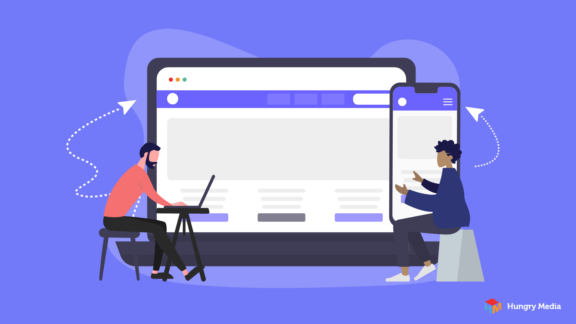
Website navigation refers to the menu and options that direct users through pages on your website. There are several types of website navigation, but the most common are header menus at the top of a website, side menus – usually located on the left side of the screen, and links in the footer. While defining “good” website navigation design can be tricky, we all know what it feels like to deal with poor website navigation design. So, let’s start there.
Think of the times you’ve tried to accomplish something online that seems like it should be simple, but isn’t. Perhaps you go down a four- or five-page rabbit hole assuming you’re on the right track, only to realize that you’re not. And now you can’t figure out how to backtrack and head in a different direction. Or maybe your on a fresh, modern-looking website but you have no clue where to find typical website navigation elements like a shopping cart, contact information, or search button. The way you feel in these moments may be a result of poor website navigation design.
What Makes Good Navigation
On a website, the best navigation creates a pleasant experience by offering clear, simple, intuitive options that help users find what they’re looking for and accomplish their goals.
Furthermore, effective navigation structure design improves conversion rate and search engine optimization. A thoughtful website navigation menu may also have the following benefits:
- Improve website traffic.
- Increase session length – the length of time users spend on a website.
- Increase the number of pages visited per session
By contrast, ineffective website navigation techniques put you at risk of losing customers, creating a negative brand impression or both.
Website Navigation Best Practices
When considering website navigation, the following practices can have a big impact.
Think like a user. User interface and user experience should be top of mind during all phases of website design, navigation included. What steps are users likely to take as they move through your website? Where do they expect to find each item? Website navigation elements and design should always start with users’ needs in mind.
Use intuitive website navigation. What path are users likely to take before making a decision? Think through how they will arrive at a specific location or to a point of taking a specific action. Design navigation to remove as many obstacles along this intuitive path as possible.
Stick to convention. Out of the box thinking serves us well in many situations. Website menu design is not one of them. Users have come to expect a few “standard” website navigation menu options, such as:
- Main menu items within the header.
- Menus that condense on small screens.
- Contact information and social buttons in the footer.
Deviating from standards can make web page navigation frustrating for users who expect something different than what you offer.
Avoid generic terms. Avoid non-specific menu terms such as “products” or “services.” Instead, include something more descriptive like “pet products” or “dog-walking services.” Not only does this help users decide where to head next, but it helps search engines predict what can be found on each web page.
Limit menu items. Users tend to scan websites, by default. So, the fewer options available at any given time, the easier your website navigation will be. A general rule of thumb is no more than seven menu items in your main website navigation bar.
This doesn’t mean you have to minimize website offerings, only that you should provide a few options at a time. Instead of adding a menu item for each of ten pet products, consider menu items for “Cat Products” and “Dog Products.” From there, include links to each of the five products per pet.
On this note, avoid using more than two menu levels in the top navigation bar. Doing so leads to more difficult decision making on the part of your user.
Put menu options in the right order. Users tend to remember the first and last items in a list more easily than those in the middle. Effective website navigation design places the most important menu items at the top and bottom of a vertical menu or left and right side of a horizontal menu.
Use a sticky navigation bar. This simply means the navigation bar will remain at the top of the page, regardless of how far a user scrolls. When you have a large amount of content on a page, sticky navigation bars ensure users have easy access to menus at all times.
Make hierarchy simple. Make it easy for users to understand your site organization by leveraging constructs they’re already familiar with. Examples include starting broad and narrowing with each step, alphabetized lists, chronological order, etc. The most appropriate construct depends on your business offerings and the amount of content on your site. Regardless of how you choose to organize it, sticking with an intuitive flow will yield the best navigation design for your website.
Guide users with visual cues. Sometimes users find your site without a perfectly clear understanding of what they need to accomplish. Effective landing page navigation includes links, calls to action, suggestions for related content, and anything else that connects users with your brand while guiding them through your site.
How to Improve Website Navigation Design
If your navigation could use an upgrade, take the following steps.
- Find the needs of your user. Who is landing on your site, from where, and for what reason? Are they coming to collect information? Make a purchase? Find recommendations?
- Establish your goals. What is the purpose of your website? You need a clear understanding of your website’s primary function before you can construct effective navigation. Only you will know for sure what that is, but the most common include increasing sales, building a distribution list, improving brand awareness, or pointing users to social media sites.
- Create a site map. You can begin planning a web navigation site map after you’ve clarified the needs of your user and function of your website. This is a list of all the pages on your site, how they are categorized and how they connect to each other.
- Determine flow. Once you know how your site will be laid out, choosing header and side menu options will be relatively simple. Remember, your navigation guides users through your site, so it can be helpful to start with the end in mind and work backward from there.
Hungry Media Helps Navigate Website Design
Website navigation design is just one of many factors that combine to create an effective online presence. If your head spins at the thought of web design and development, let alone successful design and development, we’re here to help. Our team of qualified professionals works with clients in all industries and in all phases of design to create a website that meets the needs of their business. Contact us today to learn how Hungry Media can help you make the most of your website and take your business to the next level.
contributed by Melissa Lucas, senior staff writer