You’ve done it! You’ve made the mental leap and decided to build a new website. Now what?!
Whether you’re building a site for your brand-new business, or your existing site needs an overhaul, the plethora of web design elements to consider can be overwhelming. But don’t worry. We’ve got you!
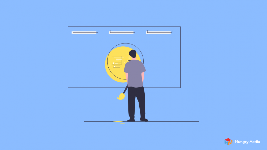
Web Design Elements to Avoid
Elements of good web page design include the obvious – a beautiful aesthetic, fast load times, a logical layout; however, there is more to effective web design than one might think.
The good news is that you don’t have to be an expert in web design principles and elements to spot a bad design. This is why the best place to start is by reviewing a few “Web Design Don’ts.”
We’re willing to bet you’ve come across at least a few of these elements during your browsing sessions.
Images
Photos and other graphics are among the most basic web design elements, and they are incredibly important. Done right, images compliment your copy by providing information that makes your message more understandable. To this end, try to avoid these image-related missteps:
Stock photography – It’s usually pretty cheesy, and your visitors will know that it’s stock. Original photos are always best.
Irrelevant images – Photos should provide clarity and add meaning to your text. If your user can’t draw an explicit connection between your image and your text, you’re better off with no image at all.
Non-responsive images – Users view your site on a variety of screen shapes and sizes. For this reason, responsive web design elements are a must. Images, specifically, should re-size to fit the device on which they are viewed.
Fonts
Flat web design elements will make your site easy on the eyes. Simple typography is a great place to start because font is a form of communication in and of itself. Font choice conveys a message before text is even read. As such, you’ll want to avoid the following font-based faux pas:
Cursive – Cursive or handwritten fonts can be difficult to read. When text is difficult to read, users have to work harder to understand each word. This can break their focus on the message you are trying to convey.
Too Many Fonts – Variation in fonts is distracting and takes away from the flat design look most users gravitate towards. A good rule of thumb is to stick with two or three fonts, max.
Extra large or small text – Text should be legible across all devices. Very large or very small font size doesn’t always translate well to various screen sizes. A huge swing in font size can also fall into the “too many fonts” category, above.
Navigation
Confusing navigation is one of the most common web design mistakes we see. We’re all for creativity, but this is not the place for it. Navigation should be as intuitive as possible, i.e. it should work in the way people think. Reinventing the wheel will only frustrate your users, and they’ll be more likely to leave before they’ve seen what you have to offer. To avoid this, skip these navigation no-no’s:
Animated navigation – Anything that flashes, bounces, or scrolls will make navigating your site more challenging than necessary.
Images as navigation buttons – If you opt to use images as a part of your navigation, make sure each image is accompanied by clear, concise text.
Uncommon placement of navigation buttons – Proper placement of navigation options makes your site easier to use. Regardless of how cool it looks, going against the grain here will only lead to confusion.
Pop-ups
We get it. Pop-ups can be necessary, at times. But do your best to eliminate them where possible. This is one of those web design elements that immediately makes users think “advertisement.” Many just close the pop-up instinctively, without even registering its content.
If you must use a pop-up, make sure it is easy to exit. When someone visits your website and can’t find their way out of your pop-up, they leave. Plain and simple.
Prominent Backgrounds
There are many background options that look great on their own, but when combined with content just become too much. Most sites should opt for simple, clean backgrounds. This allows users to focus on your text, graphics, and calls to action.
Background Music
Just don’t. Not only is music incredibly distracting, but you run the risk of deterring visitors who dislike it. If including sound is important for the sake of your business – like if you’re promoting your music – include media players that allow users to start and stop the music at their convenience.
DIY Web Design
You don’t need to be an expert to design a decent website. In fact, there are several tools available to help get started. Surprisingly, one of the most common is photoshop. Web design elements can be laid out with Photoshop and later converted into a functional template. And then, of course, there are the premade templates many hosting services offer. Most templates can help you avoid common elemental web design mistakes, like those discussed above.
Professional Web Design
Of course, we’re here to help if you’d like to take it a step further. Whether you have an awesome idea to get off the ground, a site in need of a makeover, or something in between – reach out! We’d love to discuss your website and share our painless approach to the design process. info@hungrymedia.co
contributed by Melissa Lucas, senior staff writer
")


